The livery design of a Formula One car is as meticulously calculated as the engineering of the car itself.
Every shade, every sponsor placement, every graphic flourish is selected for more than just aesthetics. A Formula One car may be built for speed, but its livery is built for perception – a masterpiece in shaping brand identity, commercial real estate and fan allegiance before the lights go out.
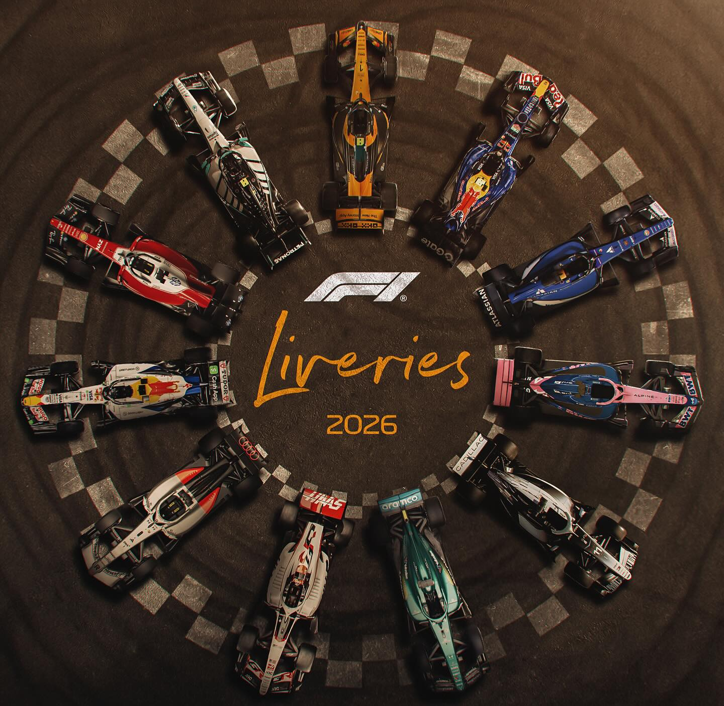
At the beginning of each new season, fans eagerly await the release of the updated team liveries, with all eyes on which will stand out the most. Each team reveals its new livery in January or February, ahead of the testing sessions and season opener in March. For those new to the sport (hello and welcome!), it’s also common for the teams to unveil a few special liveries throughout the season. These aren’t revealed ahead of the season, but rather appear as carefully planned weekend surprises to energise fans, celebrate a brand partnership, or frankly, drive merchandise sales.
Last season, teams across the grid graced us with beautifully revised liveries. But leading the charge in reinvention was Visa Cash App Racing Bulls, unveiling five special liveries in Japan, Miami, Silverstone, Austin and Las Vegas. The pink Barbie-like design for Miami captured media headlines, whilst the stunning holographic style in Las Vegas mesmerised under the circuit’s harsh artificial lights.


These designs were never simply aesthetic indulgences. Visa Cash App Racing Bulls occupies a unique position on the grid as the junior sister team to Red Bull. With similar team names and overlapping blue colour palettes, the visual overlap has long blurred brand distinctions across the paddock and among fans. What Racing Bulls executed so effectively last season was differentiation through design.
The branding strategy leaned unapologetically into their ‘younger sister’ reputation. Bright colour palettes, experimental finishes, and high-impact visuals signalled energy, a carefree attitude and creative risk – attributes that the more established, championship-proven Red Bull cannot explore as freely. While still aligned with the wider Red Bull identity of pushing the limits in extreme sports, Racing Bulls used its canvas to carve out a narrative that shouted, ‘we are young, bold and not afraid to take risks’.
Formula One is a sport where brand equity is as valuable as finishing on the podium. To purposefully disrupt visual expectations is about more than just creative and playful designs – it’s a calculated power move. And a youthful middle finger in branding to the rest of the grid.
Last season’s standouts were imaginative, innovative and commercially astute. But with 2026 marking an entirely new era with smaller cars and regulations changes, the question is no longer who experimented best last year – it’s what story each brand chooses to tell next.
Audi Revolut F1 Team
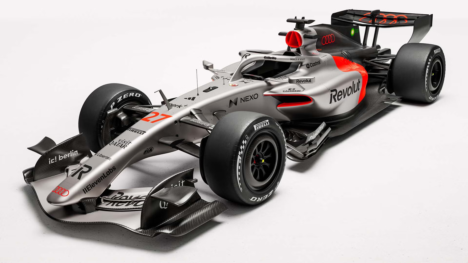
We have sadly said goodbye to the striking neon green of Stake Sauber, and hello to this half-silver, half-orange-red Formula One car. A beautifully designed livery that is equally as striking as it is luxuriously subtle. It speaks clearly to Audi’s existing customer base, drawing in fans from its existing pool of devotees.
My favourite livery of all time is the McLaren MP4-24 from 2009, thanks to the shining chrome and burnt-orange colouring that stood out on track. And what I enjoyed about the Stake neon green was exactly that – it stood out amongst a sea of blue, hints of red and the odd flash of papaya. It was truly unique and a welcome colour selection from the Swiss team, now reduced simply to memory.
The newly designed Audi, however, is bold and artful in a manner that screams quiet luxury and is more understated. The chrome design is not like the previously glistening McLaren MP4-24 – it is muted, dialled back, and akin to wider Audi branding. Clearly linked to the manufacturer, it is subtler than the flashy chrome we have seen before and feels appropriate for a well-established brand sitting within the luxury market.
Softened to an elegant grey, the simple first half of the car has oddly captured the quiet luxury the brand naturally exudes. A few key sponsors are positioned thoughtfully on either side of the car, including title sponsor Revolut, but the nose remains clear. An uncluttered area of glowing chrome that gently boasts the team’s lack of need for a plethora of sponsors. Another subtle nod toward the quiet luxury Audi offers.
Then we look at the back portion of the car. An orange-red block surrounded by black draws the eye towards the striking colour. Granted, it is rather simple yet, when positioned between the chrome and jet black, it offers a vibrant punch of energy. Bold clashes with subtle, and an air of affluence washes over the car. The lack of sponsors in that block of colour seals the deal, with nothing to distract from the daring design.
There is nowhere to hide with this livery; it is almost nonchalant in manner.
Paddock Positioning: Goodbye youthful neon green, hello affluent silver chrome.
Cadillac Formula 1 Team
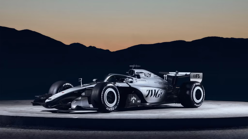
A yin-and-yang theme that deserves worship, the design of the newest grid contender is a marvel of ingenuity and innovation expertise.
As the newest team on the Formula One grid, the Cadillac livery was always going to make headlines. After significant resistance from Formula One, the American giant has finally joined an elite class of manufacturers who call the paddock home with their own team, alongside GM Motors and TWG Motorsports – an anticipated moment of delight for those who revel in an even more crowded starting line-up.
Regulatory policies aside, the eleventh team has made an inspired monochromatic splash with its 2026 challenger. To the lead architect and enlightened innovator behind the design, you deserve a raise. Most teams harbour some form of monochrome within their designs, Haas springing to mind as the leader in this field. However, none of the liveries in recent years demonstrate as much constraint by using just white and black. There is a certain admiration that comes from this form of self-control – daring to shun the rainbow of hues available and instead, delivering a piece of art rooted in luxury minimalism. But what makes this design so enticing is the striking asymmetry that could lead to its ban.
In Formula One, the rules stipulate that the car colour scheme must be symmetrical. It is a rather odd regulation, but Cadillac CEO Dan Towriss shared why the two colours are meaningful for the brand. Black represents a bold attitude, whilst white reflects a feeling of fresh, clean optimism. It is also a subtle hint to the manufacturer’s monochromatic badge and departs from the traditional American brand badge: bold red, blue, gold, and chrome. The question is, why has Cadillac purposefully differentiated their branding? There are a few potential reasons. Firstly, they wish to be seen as more than just another automotive manufacturer entering the ring, and have loosened their grip on that reputation. Secondly, associating the renowned brand with a team that has yet to prove its success could potentially risk the brand’s reputation (depending upon the results). And thirdly, the design may also reflect a desire to broaden the brand’s appeal beyond traditional American associations.
The Formula One circus is already brimming with world-class, immovable car brand identities. Perhaps, they are looking to do what Alpine could not. After all, when the French team took over from Renault a few years ago, bringing that beautiful metallic blue to the grid, they also brought their brand to a declining team. Although they are starting to make headway in this year’s championship. Even top teams like Ferrari and Mercedes struggle to get it right some years, despite being long-term participants in the sport. So, Cadillac are unlikely to get it right the first time. Success also partly hinges on driver selection. Hiring two of the most experienced drivers on the market right now – Valtteri Bottas and Checo Perez – could signal a calculated, cautious entry. It’s not a surprise that Cadillac will likely face steep challenges ahead and require expertise to make break through.
What’s more, given how new the team is to the grid, the brand could be hesitant about using its famed colours until the team is more established. And perhaps they’re looking to broaden their horizons and look beyond their American boarders. Little fuss has been made about their State-side roots, and come to think of it, Haas has been rather quiet of late, too.
Regardless of which course the brand has taken, the conversations surrounding this design have also generated more media coverage than the Super Bowl launch ad alone. So hats off to the design and PR teams.
The design brings something new to the grid, which is quite rare for a crowded field where designs are restricted and must appease those all-important sponsors. It is distinctive and will no doubt shine brightly from the back of the grid. Cadillac has produced the livery of the season.
Paddock Positioning: Deserved to be banned for simply blinding competitors with strategic monochrome sunlight and winning the design race.
Oracle Red Bull Racing
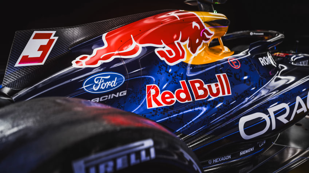
The 2010s called; they want their livery back.
There is something deeply satisfying about an ultra-metallic livery that you know will shimmer underneath every single circuit floodlight, studio spotlight and camera flash. With a striking iridescent blue that dazzles the rest of the grid, the new livery confidently signals Red Bull’s intended return to championship-winning form. Seemingly leaving the drama of Christian Horner’s abrupt departure behind, the brand enters a new era under the leadership of Laurent Mekies, and the livery design nods proudly to the team’s glory days. With its almost spray-painted effect, the car looks less like a machine and more like a moving piece of artwork.
The most striking detail of the new appearance is the metallic red bull stretched across the air intake. Just beneath sits the logos of Red Bull and new power-unit partner, Ford Racing. The logos are modest in size compared to those of Oracle, Carlyle, and Gate. Yet the placement feels purposeful and perfectly balanced, calmly presenting the new partnership as though it had always been there.
Since joining the sport, Red Bull has long delivered a sleek, modern design, though the team has occasionally received criticism for its lack of livery reinvention over the years. When the team’s identity is so distinctly associated with the wider Red Bull energy drink brand, there is naturally only so far you can push design changes. By contrast, rivals such as McLaren have managed to evolve their visual identity over the decades and maintain their branding. Moving from cars that were predominantly chrome, black, or white with flashes of orange, to the unmistakable all-papaya design we now know and love, McLaren has proved how a brand can reinvent its look without losing its identity. Perhaps one day Red Bull will step further outside of its branded comfort zone and attempt a truly radical concept. But honestly, that is what sister team Racing Bulls is for.
For now, the refreshed metallic look feels energised, confident, and unmistakably Red Bull-esque.
Paddock positioning: Nostalgia is a mind’s trick. Is the new car a bull in sheep’s clothing, or just another exhibit for the Red Bull museum?
TGR Haas F1 Team
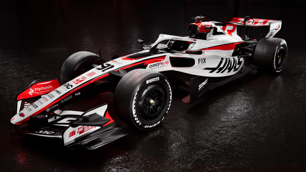
It appears that the Ferrari engine isn’t the only thing Haas has borrowed from the legendary team this year. It looks like they are sharing paint buckets, too.
A bold swipe of Ferrari red runs the length of the car on both sides, while cool white replaces the carbon fibre black of last season. The red brings a thread of power, influence and fearlessness, hopefully reigniting the back-of-the-grid regulars with an injection of prancing-horse speed. The result is a refreshed livery that feels modern, confident, and more cohesive – fitting for a team that is no longer fighting for its financial survival. Instead, they are peacocking their energised feathers and strutting in front of the other teams as a future championship contender.
The most striking new feature on the car is the confident GR, positioned at the rear of the top air intake and on the front wing. A black G nestled against a bold red R grabs attention, and it instantly clicks that these are the key sponsors this year. The majority of sponsors are positioned on the front nose, in a clear structure of black logos against that dazzling white. It is clean and smart, allowing the eyes to wander across the full length of the car rather than demanding too much attention. Despite the cars also being smaller, the design feels spacious. The balance between sponsor logos and negative space from the white undercoat feels sleek and faultless. There is a tendency for teams to cram too much onto the cars, with logos blurring into one. The VF-25 fell victim to this; the VF-26 does not.
No longer the only American-owned team on the grid, thanks to Team Cadillac, Haas proudly displays its heritage on the nose with a sizeable flag. It is an obvious contrast to Cadillac, which omits overt references to the States. In a politically tense moment, some brands may opt for subtlety; Haas chooses visibility. It is a moment when national identity feels more loaded than ever, but the Banbury-based team leans fully into its American ownership, paying homage to Gene Haas without hesitation. In truth, the American market is so ripe with potential and big-buck sponsors that teams can’t ignore the superpower.
An unexpected addition, but that Haas livery has earned its spot on this list. Offering a design statement that commands attention and rebuts sniggers from anyone who questions the team as future race winners, it is a subtle power move against the midfield and an assurance of their ambitions.
Paddock Positioning: Clean, smart and contemporary. Perhaps the extra Ferrari paint will offer a better speed advantage.