Designing an aesthetically pleasing Formula One car no doubt sounds easier than it is. Balancing heritage, brand identity, sporting regulations, and the insatiable desire from fans for novelty is no small feat. Throw in the joys of a cost cap, set brand colour palettes, and specific sponsors requirements, and it becomes a minefield of can and can’t.
You can use the signature red our brand is known for, but you can’t as the fans demand a slightly different shade that reinvigorates their spirits and makes them believe in us again. You can put that sponsor there, but you can’t make their logo that small because they pay an extortionate amount for no one in the grandstands to see it as the car speeds past. And you can use that shade of yellow, but you can’t, as it looks like someone has thrown up on the car.
In the end you’ve accomplished the enormous task of catering to everyone’s desires and championship-winning hopes, and you’ve created a masterpiece that looks like something Davinci himself has painted.
Oh, but wait – the CEO hates the whole thing, so you have to scrap it and start again.
That, I imagine, is a design engineer’s dream afternoon – a high-stakes ballet between creativity, sponsorships, and ego. Honestly, I don’t envy them.
In the last post, we explored which Formula One teams are kick-starting the year with bold, artful, inspiring liveries.
This time, we are analysing the 2026 liveries that offer quieter and restrained approaches to design, carefully balancing traditional brand identity with future championship aspirations.
Aston Martin Aramco Formula One Team
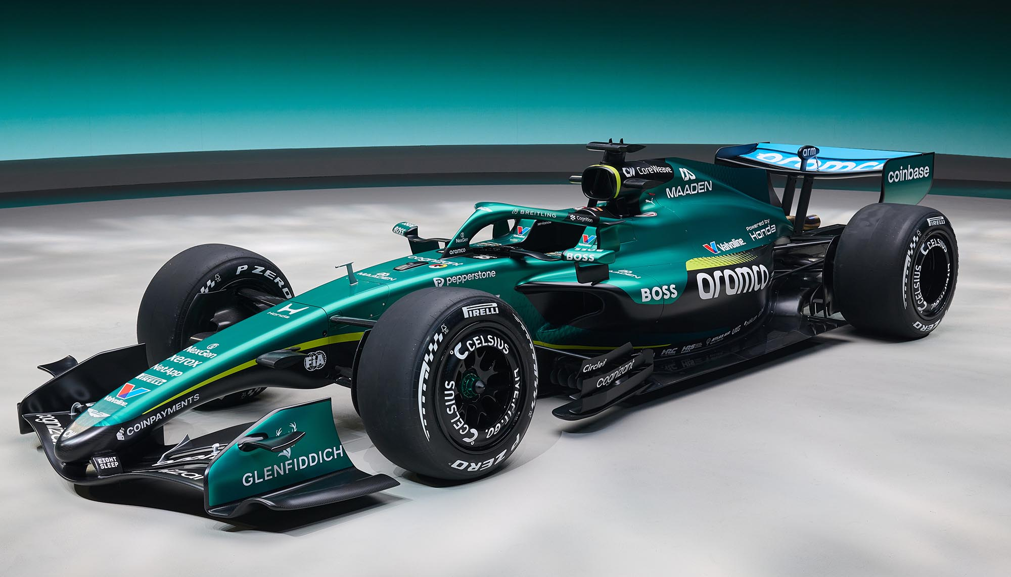
If consistency were a competitive advantage, the Aston Martin AMR26 would be leading the field. It is a first from the renowned engineer and current Team Principal, Adrian Newey, and it speaks brand confidence. The redesign retains the traditional racing green colour synonymous with the Aston Martin brand, complemented by lime green accents on the side pods, for a smart, reserved, business-as-usual design approach.
Is it the most exciting livery on the grid? From a fan perspective, it hasn’t dominated social feeds. The accents of lighter green provide a pop of colour for what would otherwise be a rather simple colour palette, similar to that of the last few years. However, from a corporate brand identity lens, it hits the mark beautifully.
When your brand is associated with a specific colour, do not change that. Think back to the backlash following Jaguar’s colour pivot to soft pink a few years ago, and it proves how emotionally tied audiences are to heritage.
The traditional racing green associated with the team denotes exclusivity, prestige, and a heritage British brand. That is a reputation that money cannot buy, and a lick of paint from a competitor cannot replicate. The sponsor logos in white are deliberately understated and gently complement, but that green clearly shouts Aston Martin.
Creatively, it is a conservative business-focused design that favours functionality over inventiveness. But commercially, it perfectly conveys a strong brand identity and will be immediately recognisable on track.
Paddock Positioning: Strategically sharp but creatively restrained.
Atlassian Williams F1 Team
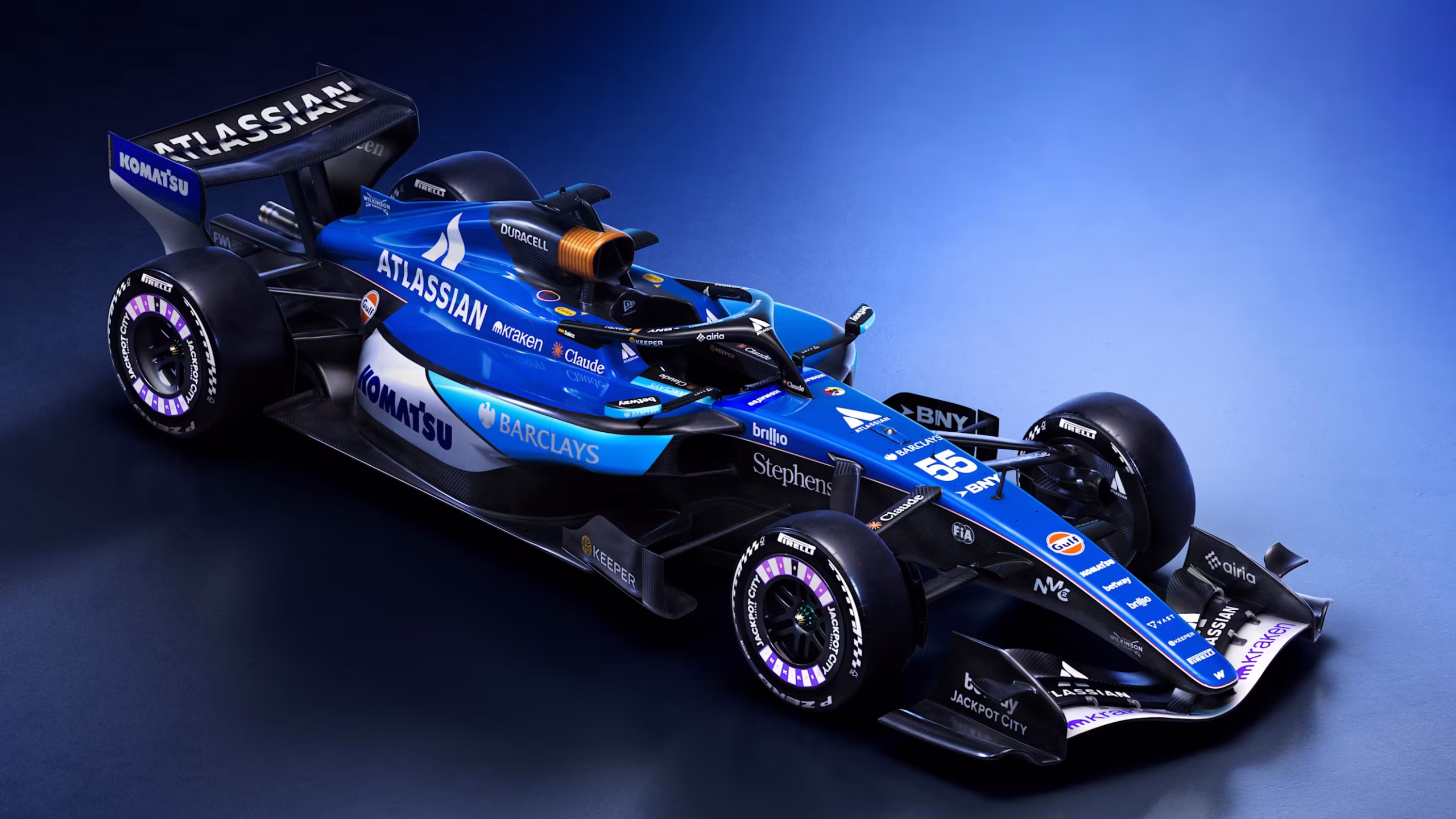
Bright blue blends brands beautifully.
Just as alliteration repeats, so does Williams with a car that is blue, upon blue, upon blue. Blue is associated psychologically with feelings of trust, intellect, and order, so it is not a surprise to see multiple teams on the grid aligning themselves with these attributes. It is a strategic branding move and one that Williams rather needs, following years of tumultuous race results and a sought-after reputation revamp. Whilst the team has always been predominantly blue and white, the white has been quietly retired as each season has passed. Team Principal James Vowles is in his third year leading the Grove team, and his tenure this year is off to a good start with a tastefully designed car. The design voices disruption through angular shapes in an almost modern architectural concept, elevated by three shades of blue – an upgrade from the dual-tone last year.
The jewel of this livery is the iconic Duracell partnership that covers the air intake. A striking, memorable and frankly inspired feature, this design is a standout on the grid. Cleverly, it illustrates the household battery through a design that aligns both brands with power, performance and reliability – again, a reputation Williams is intent on restoring.
A sleek, modern design approach, the new livery reflects Vowles’ continued ambition to brighten the team’s prospects (a strategy already showing early returns). The only point of contention with the design is that it gets lost in a sea of blue liveries, and is in danger of visual anonymity amid a grid awash with similar palettes – rather than celebrated for its ingenuity. It takes tradition and shakes it up, tastefully.
Paddock Positioning: Rebuilding credibility, one shade of blue at a time.
BWT Alpine Formula One Team
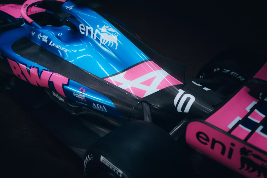
Alpine appears to have followed a classic idiom for its A526: something old, something new, something borrowed, and the classic, something blue.
Something old – maintaining key partnerships with sponsors such as MSC Cruises, Castore and fuel partner, Eni.
Something new – moving forwards from Renault, the new car now features coveted Mercedes-AMG power units and gearboxes.
Something borrowed – the beautiful signature baby pink from title sponsor BWT.
Something blue – naturally, the Alpine automotive brand identity.
Whilst it is not the most inventive nor imaginative livery design on the grid this year, the A526 is certainly easy to spot amongst an abundance of blue, red, black and white. The pink BWT is one of the most iconic colours in the paddock, only slightly inferior to the red prancing horse a few garages down. It does feel like somewhat of a missed opportunity that the most identifiable aspect of the car is limited to only certain areas of the design. Though understandably, Alpine owns the team and, of course, would want their blue brand colour to be front and centre. For differentiation on track and to give the fans a little extra visual delight, a few more splashes of that BWT pink would not go amiss. After all, a touch more pink might draw more attention to an otherwise quietly low-profile team – even before the racing starts.
Last season, Alpine finished at the bottom of the team standings, with rookie Franco Colapinto scoring zero points and seasoned driver Pierre Gasly achieving just 22. In this context, the A526 livery must do more than turn heads or please key sponsors. It has to project renewed belief and ambition while reinforcing investor confidence. A bold, instantly recognisable livery design signals to sponsors that the team is unified and serious about reversing its fortune from the past few years. By emphasising BWT pink alongside the Alpine blue, the car communicates both heritage and energy.
And, in a sport where perception matters as much as performance, the livery becomes a quiet ambassador for confidence. Alpine should not shy away from standing out or putting all its chips on the table, and it looks like their performance is beginning to grow.
Paddock Positioning: On the track, more pink might not add horsepower, but it would make the paddock blush in awe.
Scuderia Ferrari HP Formula One
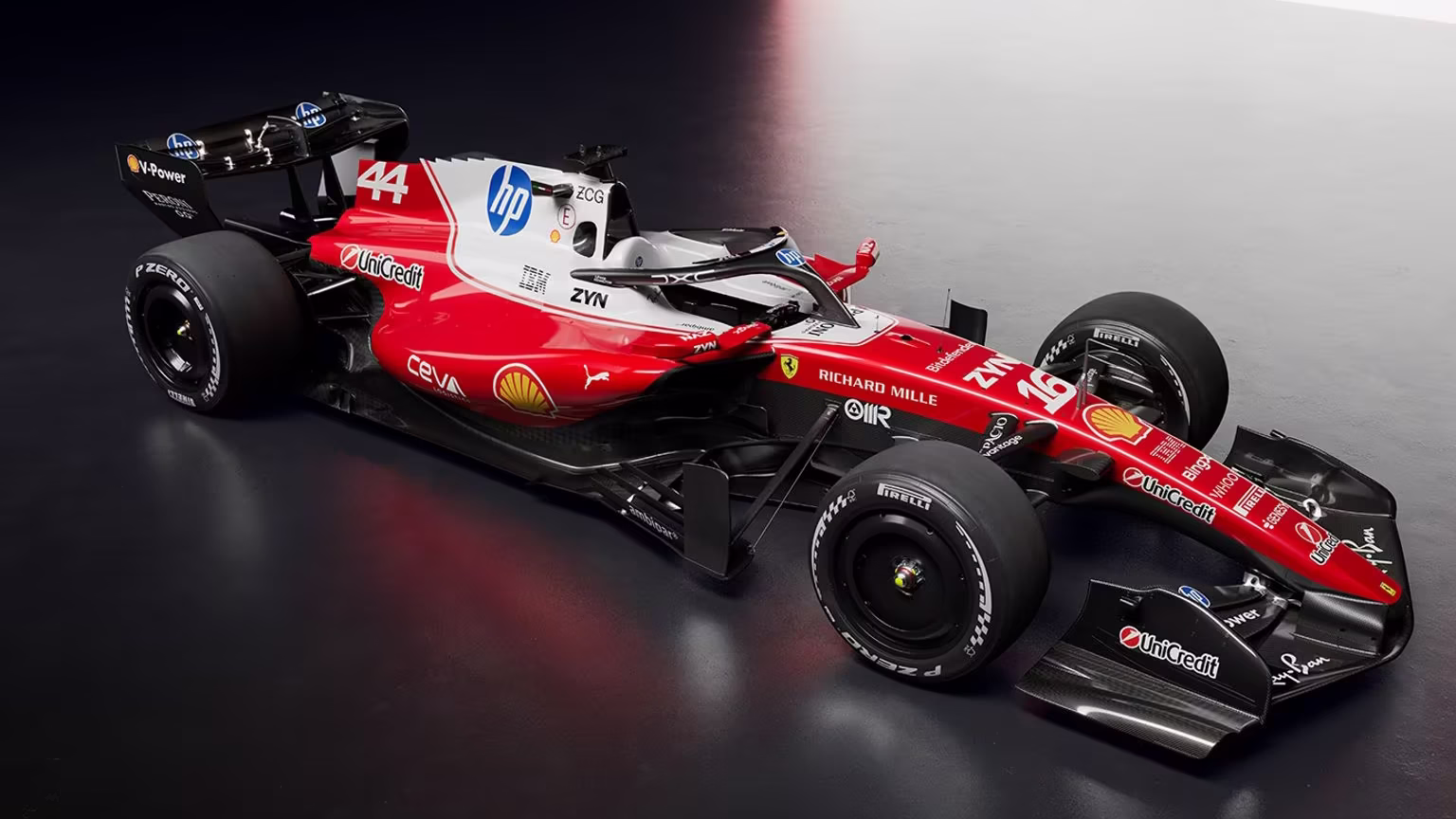
Speaking of the red prancing horse, Ferrari has served an interesting livery this year, adding more white. Ferrari’s red is a core part of the brand’s identity and the Tifosi are passionate loyal to that colour. So to add more white? It could be see as a bit of an own goal.
But this is exactly why we’re talking about the need to balance tradition with identity evolution. To maintain cultural relevance and project the image of forward motion, a brand must always keep reinventing itself. It’s not enough to just create a brand identity and leave it as is, never changing or seeking improvements, because frankly it gets boring. It becomes tired, run-down, culturally less-relevant and people move onto the next new and shiny thing.
So for Ferrari, as arguably the most well-established and prestigious team on the grid, there must be some form of reinvention in order to keep fans engaged and excited, whilst also enticing potential future sponsors. For a team that is synonymous with just the colour red, that is not easy.
This year, the team is clearly expanding it’s partnership with HP and has sacrificed some of the red paint in favour of sponsor real estate. It’s not the most offensive thing in the world, but it does seem that the team is slowly eradicating the red year upon year, as the white splashes continue to grow.
But it also symbolises a move away from the past few years, when car performance has been a consistent issue. And from an external perspective, this reinvention look towards a renewed sense of identity, with strong partner alliances and a fresh outlook on the competition.
That’s what this livery says – fresh, modern, forward-thinking.
Paddock Positioning: Ferrari are red, Alpine is blue, let’s hope the white improves their power performance too.